How to Create Notion Charts & Graphs - 2024
.png)
Notion has always been a powerful tool for organising and managing information. Whether you’re tracking projects, managing databases, or documenting processes, Notion’s flexible interface has made it a favourite among professionals and individuals alike.
Now, with the introduction of the new Notion Charts feature, the platform has taken a significant leap forward in data visualisation, enabling users to create dynamic, interactive charts directly within their pages.
This new capability transforms how you can present and interpret data in Notion, making it easier to understand complex information at a glance.
Understanding Notion Charts!
Notion Charts is a newly released feature that allows users to create and embed charts directly within their Notion pages. This update, announced on August 13, 2024, introduces a variety of chart types that can be linked to databases, enabling real-time data visualisation.
With this feature, you can now easily turn your database entries into visually appealing charts, providing a more intuitive way to analyse and present your data.
The Notion Charts feature is designed to be user-friendly, offering a seamless integration with existing Notion databases. Whether you're tracking project progress, analysing financial data, or visualising task completion rates, Notion Charts offers a versatile toolset to enhance your workflow.
Key Features of Notion Charts
- Multiple Chart Types: Notion Charts supports several types of charts, including bar charts, line charts, pie charts, and more. This variety ensures that you can choose the most appropriate visualisation for your data.
- Real-Time Data Syncing: The charts are directly linked to your Notion databases, meaning they update automatically as your data changes. This real-time syncing ensures that your visualisations are always accurate and up-to-date.
- Customisation Options: You can customise the appearance of your charts, including colours, labels, size & more, to match your specific needs and aesthetic preferences.
- Interactive Elements: Notion Charts are interactive, allowing you to hover over data points to see detailed information. This interactivity adds a layer of depth to your data analysis.
- Easy Integration: Embedding charts into your Notion pages is straightforward. You can easily integrate them into your existing workspace, enhancing your dashboards, reports, and other pages.
Understanding the Different Types of Notion Charts
Notion offers four distinct chart types, each tailored for different data visualisation needs. Here's a closer look at each:
1. Line Charts
.png)
Line charts are ideal for visualiSing trends over time. They plot data points on a graph and connect them with lines, making it easy to track changes and patterns in your data. This chart type is particularly useful for monitoring progress, such as tracking sales growth, website traffic, or project milestones over weeks, months, or years.
When to Use Line Charts:
- To show data trends over time.
- When you want to emphasise the rate of change between data points.
- Ideal for comparing multiple data series on the same graph.
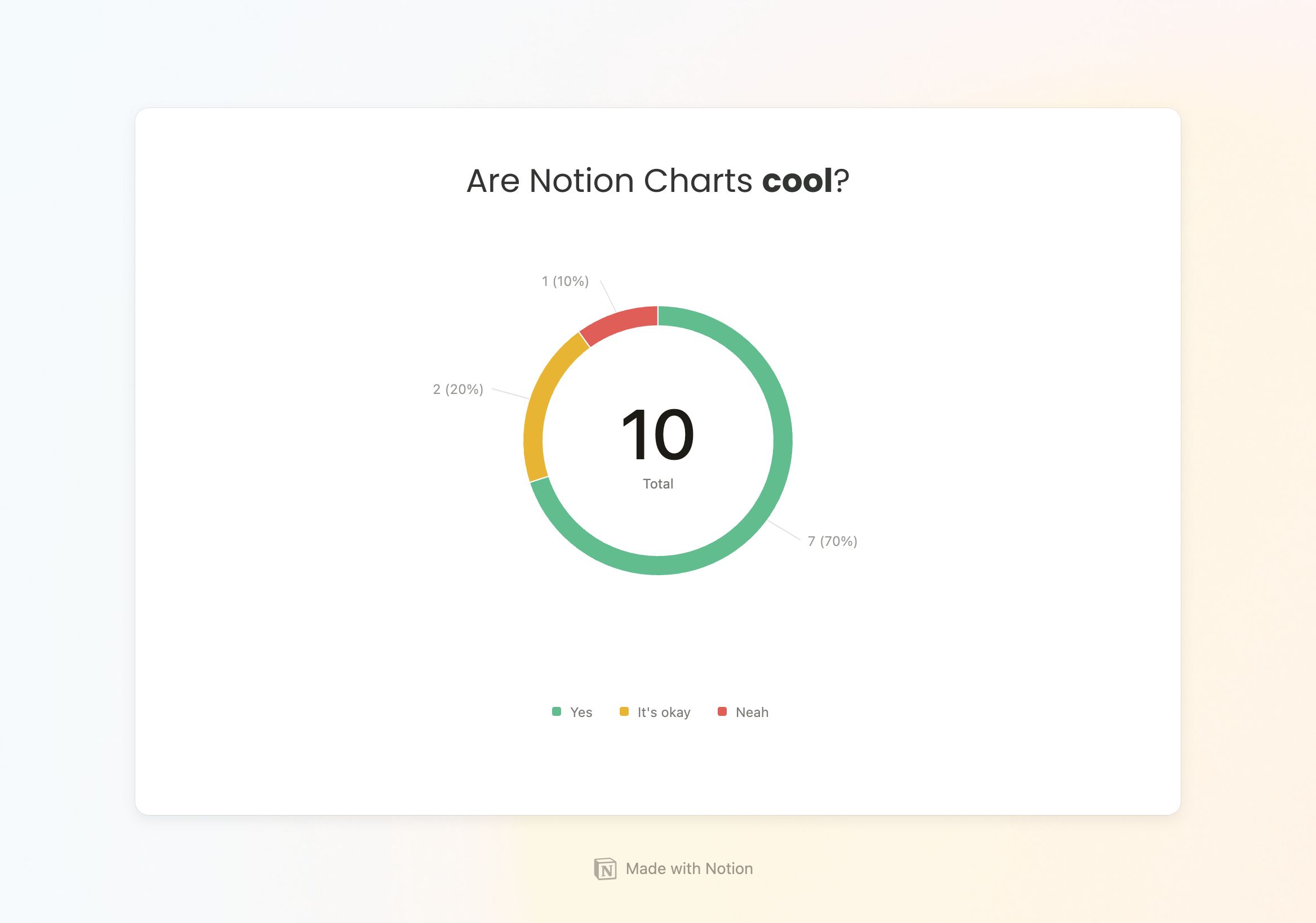
2. Donut Charts
.png)
Donut charts are a variation of pie charts, providing a circular graph that represents parts of a whole. The "donut" in the middle can be used to add additional information or just to improve the chart's aesthetic. Donut charts are excellent for showing proportional data, such as how different segments contribute to a total, like market share distribution or resource allocation.
When to Use Donut Charts:
- To represent parts of a whole in a visually appealing way.
- When you want to compare the proportion of different categories.
- Ideal for highlighting contributions to a total figure.
3. Vertical Bar Charts
.png)
Vertical bar charts display data as vertical bars, making them perfect for comparing quantities across different categories. Each bar's height represents the value of the data point, which is especially useful for comparing different items or tracking changes over time when categories are labeled along the horizontal axis.
When to Use Vertical Bar Charts:
- To compare different categories side by side.
- When you need to show changes over time for small datasets.
- Ideal for visualiSing discrete data points.
4. Horizontal Bar Charts
.png)
Horizontal bar charts are similar to vertical bar charts but are oriented horizontally. They are particularly useful when category names are long, or when you need to compare a large number of items. The horizontal orientation allows for easier readability and comparison across categories.
When to Use Horizontal Bar Charts:
- When comparing items with longer category names.
- To present a large number of categories clearly.
- Ideal for ranking data or showing the magnitude of values across categories.
How to Create Charts in Notion
Creating charts in Notion is a simple process and here is the 2 ways that allow you to create a Notion chart:
- Create a New Chart View: Anytime you are working with a database in Notion, you can easily add a new “Chart view”. Just press on the “+” icon at the views, and select “Chart.
- Embed a Chart Anywhere: Another great option for adding a chart in Notion is by using the “/chart” command anywhere inside your Notion workspace.
Notion Chart Options
.png)
Notion Charts comes with several powerful options that allow you to tailor the data display according to your specific needs. Here are the key chart options:
1. What to Show: X/Y Axes
For both bar charts and line charts, you can decide what data to display on the X and Y axes. This option allows you to select specific data fields from your database that you want to visualise, ensuring that the most relevant information is presented clearly.
2. Each Slice Represents
For donut charts, you have the option to define what each slice of the chart represents. This could be any categorical data from your database, such as different product types, regions, or customer segments, allowing you to visualise how each part contributes to the whole.
3. Sort By
The Sort by option enables you to organize your data in a specific order. You can sort your data by ascending or descending values, making it easier to highlight the highest or lowest performers or any other priority data.
4. Group By
The Group by feature allows you to aggregate data based on certain criteria. This is particularly useful for analysing data that falls into distinct categories, such as grouping sales data by region or department.
5. Omit Zero Values
To clean up your charts and make them easier to read, you can choose to omit zero values. This option is especially useful when working with datasets that include a lot of zero entries, as it helps to focus on the meaningful data points.
6. Cumulative View
In line charts, you can toggle between viewing individual data points and a cumulative view. The cumulative view adds each data point to the previous one, providing a running total that can help in analysing growth or decline over time.
7. Filter
The filter option allows you to refine your data before it is visualised. By applying filters, you can include or exclude specific data points, ensuring that your chart only displays the most relevant information.
8. Save Chart As
Notion Charts also offers the ability to save your chart as an image. This is useful for sharing your data outside of Notion, such as in presentations or reports. You can also customise the image by changing the background before saving.
Notion Chart Customisation
.png)
Notion Charts provides extensive customisation options, allowing you to tailor the appearance of your charts to fit your needs and preferences. Here’s how you can customize your charts:
1. Color Variations
You can customise the color scheme of your chart, choosing from a range of color options. This helps in distinguishing different data points and making the chart more visually appealing and aligned with your brand or aesthetic.
2. Height
The height of your chart can be adjusted to better fit your Notion page layout. This allows you to control how much space the chart takes up on the page, ensuring it integrates smoothly with your other content.
3. Grid Lines
You can toggle grid lines on or off, choosing to show vertical, horizontal, both, or none. Grid lines help in making your chart easier to read by providing a reference for the data points.
4. Axis Name
The axis name feature allows you to show or hide labels on the X, Y, or both axes. This is useful for adding context to your data, making it clearer what each axis represents.
5. Smooth Line
For line charts, you can apply a smooth line option, which smoothens the connections between data points. This is useful for visualising trends that aren’t rigid, providing a more aesthetically pleasing chart.
6. Gradient Area
The gradient area option adds a transparent gradient under the line in a line chart, highlighting the area below the line. This can enhance the visual impact of the chart, making it easier to interpret the data.
7. Legend
You can choose to show or hide the legend on your chart. The legend helps viewers understand what each color or bar represents, but in some cases, you may want to hide it to simplify the chart’s appearance.
8. Data Labels
Data labels can be shown or hidden depending on your preference. Labels add direct information to each data point, making it easy to see exact values without having to hover over the chart.
9. Show Value in Center (Donut Chart)
For donut charts, you have the option to show or hide the value in the center. This feature is useful if you want to emphasise the total value represented by the chart.
10. Data Labels Display
When using Donut chart, you can choose how they are shown: none, name only, name and percentage, or percentage only. This flexibility allows you to present your data in the way that best suits your needs and audience.
Frequently Asked Questions About Notion Charts
How do I link a chart to my database in Notion?
After selecting the chart type in your Notion page, you'll be prompted to link it to a database. Choose the appropriate database, and the chart will automatically generate based on the data.
Can I use Notion Charts with multiple databases?
Currently, each chart is linked to a single database. If you need to visualise data from multiple databases, consider merging the data into one database or creating separate charts for each.
Are Notion Charts available on all Notion plans?
Notion Charts are limited to only 1 chart for the free plan. If you want to create multiple charts, you’ll need to upgrade to PLUS.
Can I export Notion Charts for use in presentations or reports?
Yes. Notion charts has export feature allowing you to copy or download the chart as an image.
How can I customise the appearance of my charts in Notion?
Notion Charts allows you to customise colours, labels, and size & more. Simply click on the chart, and use the customisation options to adjust the visual elements to your preference.
What if my chart doesn't update automatically?
From time to time it might take a bit of time until the chart loads. Ensure that your chart is correctly linked to the database and that the database is actively being updated. If the issue persists, try refreshing your Notion page.
Can I use Notion Charts for collaborative projects?
Yes! Notion Charts are fully collaborative. Team members with access to the page can view and interact with the charts, making it easy to share insights and data visualizations.
Conclusion
The introduction of Notion Charts marks a significant enhancement in the platform's capabilities, making data visualisation more accessible and integrated within your workspace. Whether you're a seasoned Notion user or new to the platform, this feature empowers you to present data in a more insightful and visually engaging way.
By following the simple steps to create and customise charts, you can transform your Notion pages into dynamic dashboards that not only organize your information but also provide powerful insights at a glance.
With Notion Charts, data no longer needs to be a sea of numbers—it can be a clear, colorful, and interactive story that drives better decision-making.
